This tutorial presents a standardized workflow that decouples the complex task of creating scientific diagrams into two distinct stages: "The Architect" (logical construction) and "The Renderer" (visual rendering). By leveraging the powerful logical reasoning of LLMs to steer the pixel-generation capabilities of image models, we can produce publication-ready diagrams worthy of top-tier conferences like CVPR and NeurIPS.
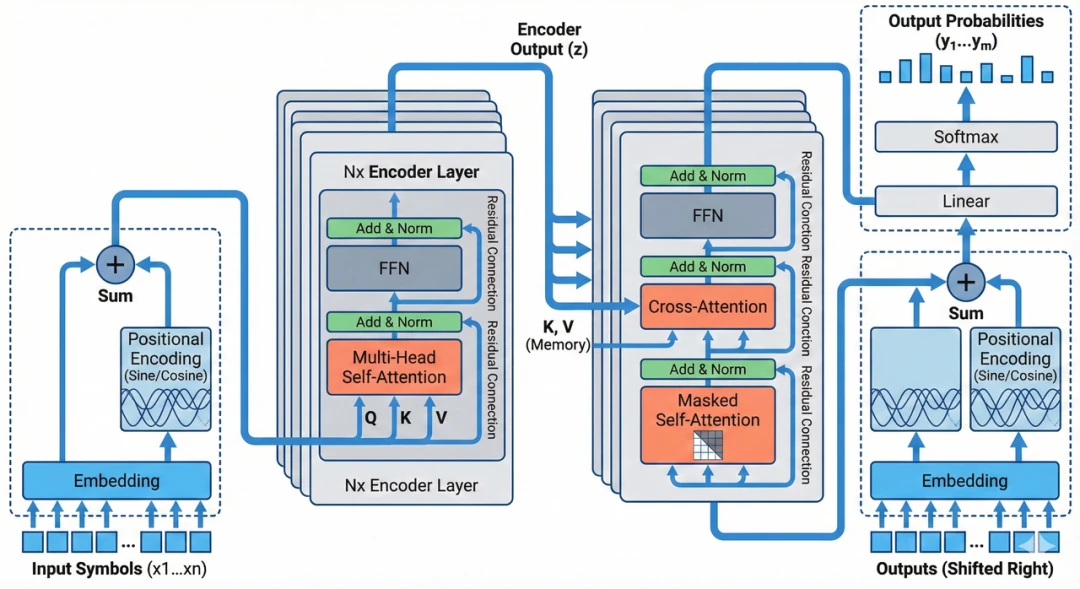
Attention Is All You Need
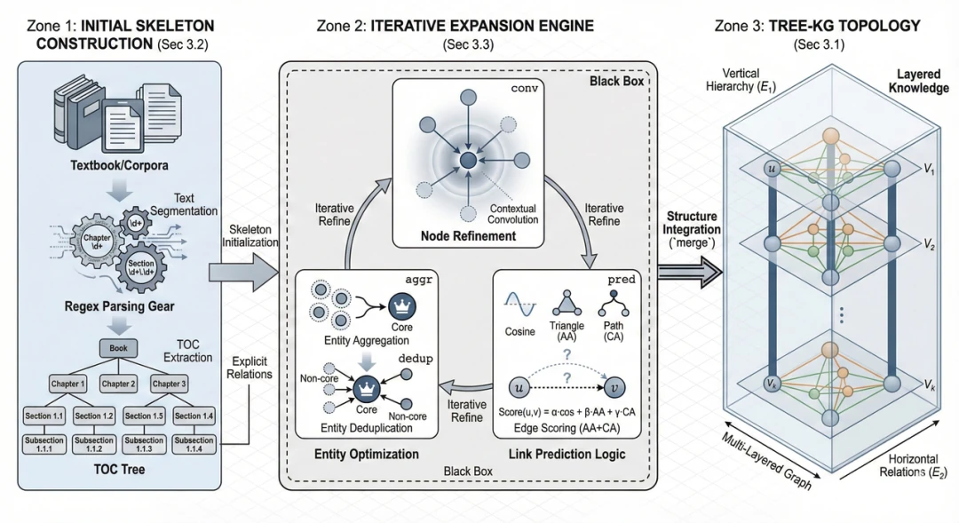
Tree-KG: An expandable knowledge graph construction framework for knowledge-intensive domains
Step 1: The Architect - Creating a Visual Schema with an LLM
Objective: Use a powerful LLM (e.g., Gemini 1.5 Pro, GPT-4o, Claude 3.5 Sonnet) to transform your paper's core concepts into a detailed [VISUAL SCHEMA].
Instructions: Copy the prompt below, then paste the abstract or methods section of your paper at the end. The goal here is to translate abstract algorithmic logic into concrete, physical descriptions that an AI image generation model can understand.
Prompt 1
# Role
You are a **Visual Architect** for a top-tier academic conference like CVPR or NeurIPS. Your core competency is translating abstract research logic into **concrete, structured, geometry-level visual instructions**.

# Objective
Read the paper content I provide and output a **[VISUAL SCHEMA]**. This schema will be fed directly to an AI image generation model, so it must use **concrete physical descriptions**.

# Phase 1: Layout Strategy Selector (Critical Step: Layout Decision)
Before generating the schema, first analyze the paper's logic and select the most appropriate **layout archetype** (or a combination) from the following options:
1.  **Linear Pipeline**: A left-to-right flow, ideal for Data Processing or Encoder-Decoder architectures.
2.  **Cyclic/Iterative**: Features a central loop with arrows, perfect for Optimization, Reinforcement Learning, or Feedback Loops.
3.  **Hierarchical Stack**: A top-to-bottom or bottom-to-top arrangement, suitable for Multiscale Features or Tree Structures.
4.  **Parallel/Dual-Stream**: A side-by-side structure, great for Multi-modal Fusion or Contrastive Learning.
5.  **Central Hub**: A central element connecting surrounding components, used for Agent-Environment interactions or Knowledge Graphs.

# Phase 2: Schema Generation Rules
1.  **Dynamic Zoning**: Based on the selected layout, define 2-5 distinct physical zones. Do not feel constrained to just three.
2.  **Internal Visualization**: You must define the "objects" (e.g., Icons, Grids, Trees) inside each zone. Avoid abstract concepts.
3.  **Explicit Connections**: For a cyclic process, you must describe it explicitly, e.g., "A curved arrow loops back from Zone X to Zone Y".

# Output Format (Required Schema)
Please strictly adhere to the following Markdown structure for the output:
---BEGIN PROMPT---
[Style & Meta-Instructions]
High-fidelity scientific schematic, technical vector illustration, clean white background, distinct boundaries, academic textbook style. High resolution 4k, strictly 2D flat design with subtle isometric elements.

[LAYOUT CONFIGURATION]
*   **Selected Layout**: [e.g., Cyclic Iterative Process with 3 Nodes]
*   **Composition Logic**: [e.g., A central triangular feedback loop surrounded by input/output panels]
*   **Color Palette**: Professional Pastel (Azure Blue, Slate Grey, Coral Orange, Mint Green).

[ZONE 1: LOCATION - LABEL]
*   **Container**: [Shape description, e.g., Top-Left Panel]
*   **Visual Structure**: [Specific description, e.g., A stack of documents]
*   **Key Text Labels**: "[Text 1]"

[ZONE 2: LOCATION - LABEL]
*   **Container**: [Shape description, e.g., Central Circular Engine]
*   **Visual Structure**: [Specific description, e.g., A clockwise loop connecting 3 internal modules: A (Gear), B (Graph), C (Filter)]
*   **Key Text Labels**: "[Text 2]", "[Text 3]"

[ZONE 3: LOCATION - LABEL]
... (Add Zone 4/5 if necessary based on layout)

[CONNECTIONS]
1.  [Describe connection, e.g., A curved dotted arrow looping from Zone 2 back to Zone 1 labeled "Feedback"]
2.  [Describe connection, e.g., A wide flow arrow from Zone 2 to Zone 3]
---END PROMPT---

# Input Data
[Paste your paper's content here]
Step 2: The Renderer - Generating Diagrams with AI Image Models
Objective: Leverage an image model's instruction-following capabilities to turn the blueprint into pixels.
Instructions: Copy the general template below. You only need to paste the entire block generated in Step 1—from ---BEGIN PROMPT--- to ---END PROMPT---—into the designated area. No modifications are needed.
Prompt 2
**Style Reference & Execution Instructions:**
1.  **Art Style (Visio/Illustrator Aesthetic):**
    Generate a **professional academic architecture diagram** suitable for a top-tier computer science paper (CVPR/NeurIPS).
    *   **Visuals:** Flat vector graphics, distinct geometric shapes, clean thin outlines, and soft pastel fills (Azure Blue, Slate Grey, Coral Orange).
    *   **Layout:** Strictly follow the spatial arrangement defined in the schema below.
    *   **Aesthetic:** Technical, precise, clean white background. This should NOT be hand-drawn, photorealistic, a 3D render, or have any shadows/shading.
2.  **CRITICAL TEXT CONSTRAINTS (Read Carefully):**
    *   **DO NOT render meta-labels:** Do not write words like "ZONE 1", "LAYOUT CONFIGURATION", "Input", "Output", or "Container" on the image. These are structural instructions for YOU, not text to be displayed.
    *   **ONLY render "Key Text Labels":** The only text that should appear in the diagram is the text inside double quotes (e.g., "[Text]") listed under "Key Text Labels".
    *   **Font:** Use a clean, bold Sans-Serif font (like Roboto or Helvetica) for all labels.
3.  **Visual Schema Execution:**
    Translate the following structural blueprint into the final image:
    [Directly paste the content generated in Step 1 from ---BEGIN PROMPT--- to ---END PROMPT--- here]
Step 3: Fine-Tuning and Iterating on Your AI Diagram
So, you've generated your first draft, but it's not quite perfect. What now? Depending on the issue, you have a couple of powerful options for editing your AI-generated diagram.
The core idea is to use the model's natural language editing capabilities for fine-tuning. If you're about 80% satisfied with the image, don't rush to regenerate it from scratch.
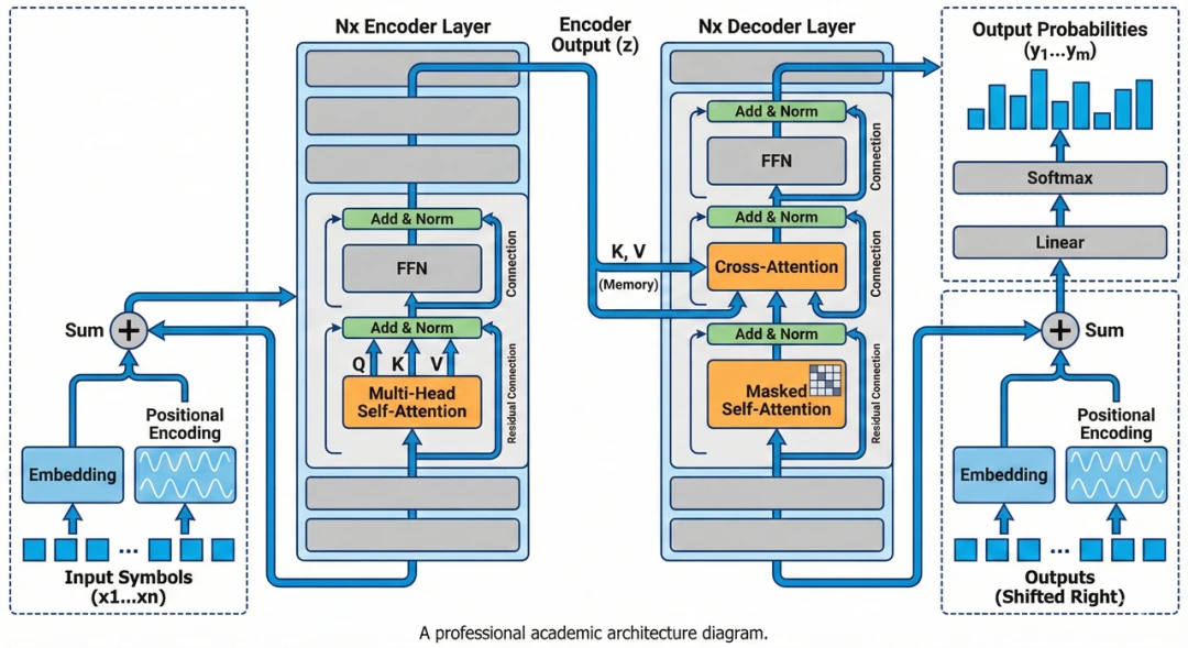
💡 On the Effectiveness of Rerolling Our tests show that simply rerolling the prompt won't drastically change the overall layout. It might alter the paths of some lines, the colors of certain elements, or the details of shapes, but the core structure will remain. You can certainly reroll to pick your favorite variation. However, for more targeted changes, it's often better to either edit the image directly using natural language or refine the prompt in Step 1. The two images below were generated from the same prompt; the differences are minor. For major adjustments, fix the prompt; for minor tweaks, use direct editing commands.
Situation A: The overall layout is good, but details or style are off
In this case, it's time for some natural language editing. You can type modification commands directly into the chatbox or use the "select and edit region" feature in the interface. The model will precisely modify the elements you specify while preserving the rest of the image. For example:
- Modify Icons: "Change the 'Gear' icon in the center to a 'Neural Network' icon," or "Replace the robot head with a simple document symbol."
- Adjust Colors: "Make the background of the left panel pure white instead of light blue," or "Change the orange arrows to dark grey."
- Unify Style: If the lines are too thick, try "Make all lines thinner and cleaner." If shadows are distracting, say, "Remove all shading and make it a completely flat 2D design."
- Correct Text: If there's a typo, you can say, "Correct the text 'ZONNE' to 'ZONE'." If the text errors are severe, the safest bet is to have the AI remove all text ("Remove all text labels") and add it yourself later in a tool like PowerPoint or Figma.
Situation B: The layout is fundamentally wrong
If a structure that should be a loop has been drawn as a straight line, or the core logical relationships are incorrect, don't waste time trying to fix it with minor tweaks. This usually means the [VISUAL SCHEMA] from Step 1 wasn't clear enough.
The right move is to go back to Step 1. Review and modify the prompt. Did you select the wrong [LAYOUT CONFIGURATION]? Was the Visual Structure description too vague? You can converse with the LLM directly, asking it to modify the [VISUAL SCHEMA] based on your feedback. After regenerating the blueprint, run Step 2 again. This approach usually solves the problem at its root.
Advanced Tips for Perfecting AI-Generated Diagrams
To elevate your diagrams from good to great, combine human oversight with a few powerful techniques.
1. Human-in-the-Loop: Fine-Tuning the Blueprint
The [VISUAL SCHEMA] generated by the LLM in Step 1 is fully editable text.
Instead of repeatedly regenerating and hoping for a better result, directly modifying the text blueprint is often faster and more precise. For example, if you dislike an icon, change Visual Structure: A robot icon to Visual Structure: A brain icon in the text. If the colors feel too vibrant, simply remove the extra colors from the Color Palette list.
2. Provide Reference Images
Language has its limits. Even the most precise prompt can struggle to capture the exact visual style or spatial relationship you have in mind. In such cases, providing visual constraints is more effective.
- Build a 'Research Aesthetics Library' and Use Style Transfer: We highly recommend creating a personal 'Research Aesthetics Library' as you review top-tier papers. Collect illustrations with clever layouts and sophisticated color schemes. When you have an image with your target style (even a rough sketch), upload it to the image generation model. Then, in the Step 2 prompt, replace the generic
Art Styledescription with a clear instruction: 'The style, layout, and color scheme of the generated figure should strictly reference the uploaded image.' This shifts the AI from a text-to-image process to a more constrained image-to-image process, giving you far more control over the final look. - Parametric Color Control: Simply telling the AI to use 'Light Blue' or 'Red' is often insufficient and can result in a simplistic, 'plastic-like' feel. Professional diagrams require parametric color control. Use a color picker tool to extract precise HEX codes (e.g.,
#E1F5FE) from your aesthetics library and specify them in the prompt. It is also a best practice to build a repository of academically validated color schemes by referencing high-quality illustrations in top journals. Feeding these proven RGB/HEX values directly to the AI can instantly give your illustrations a visual quality worthy of Nature or Science.
3. How to Address Watermarks on Generated Images
When using some AI tools via their web interfaces, generated images may have a watermark. This is often a client-side overlay added by the webpage, which can be addressed in a few ways.
- Using a Bookmarklet: For those interested in browser scripting, it's possible to block watermarks using a Bookmarklet.
- Create a new bookmark in your browser.
- In the 'URL' or 'Address' field, paste the JavaScript code below.
- When on the image generation page, clicking this bookmark will run the script. Newly generated images should then be watermark-free.
javascript:(function(){const o=XMLHttpRequest.prototype.open;XMLHttpRequest.prototype.open=function(m,u){if(u.includes("watermark"))return console.log("🚫 Blocked:",u);return o.apply(this,arguments)};const f=window.fetch;window.fetch=function(u,...a){if(typeof u==="string"&&u.includes("watermark"))return console.log("🚫 Blocked fetch:",u),new Promise(()=>{});return f.apply(this,arguments)};Object.defineProperty(Image.prototype,"src",{set(v){if(v.includes("watermark"))return console.log("🚫 Blocked IMG:",v);this.setAttribute("src",v)}});const n=document.createElement("div");n.textContent="✅ Watermark blocking active!";Object.assign(n.style,{position:"fixed",top:"20px",left:"50%",transform:"translateX(-50%)",background:"rgba(0,0,0,0.75)",color:"#fff",padding:"8px 14px",borderRadius:"6px",fontSize:"14px",zIndex:99999,transition:"opacity 0.3s"});document.body.appendChild(n);setTimeout(()=>{n.style.opacity="0";setTimeout(()=>n.remove(),300)},500);})();
- A Simpler Alternative: Add a line to the end of your Step 2 prompt, such as, 'Add a line of placeholder text at the very bottom of the image.' After generating the image, you can simply crop off the bottom section containing both the text and the watermark.
4. Post-Processing
Treat the AI-generated image as a 90% complete draft. To meet rigorous publication standards, it's best to use a vector editor like Adobe Illustrator or Figma for final touch-ups. AI-generated text can have spelling errors or inconsistent fonts. The most reliable solution is to erase the text in an editor and replace it with clean vector text that matches your paper's formatting (e.g., Times New Roman). For very long flowcharts, you can generate them in sections and then stitch them together in a tool like PowerPoint.
A clever technique shared online shows that Illustrator's "Image Trace" feature can convert PNGs into editable vector graphics. The suggested parameters are as follows:
However, in my tests, the results weren't always perfect, as the precision can be low. These settings might be better suited for the BioRender style common in biology. If you need to vectorize a PNG, experiment with the values for colors, paths, corners, and noise to improve the output. Be aware that this process can be resource-intensive.
Important Considerations: AI Limitations in Scientific Illustration
AI is a powerful tool, but it's not a substitute for critical thinking.
Modern image models have made incredible strides in text rendering and structured layouts, significantly boosting productivity. What used to be hours of tedious design work can now be accomplished in minutes.
However, we must remain vigilant against "AI hallucinations" and misinterpretations of our research. While we've used an automated method to get the AI to draw for us, we cannot be complacent when reviewing the output. You must invest the time you've saved into a rigorous review of the diagram's content. Here are a few common traps to watch out for:
1. Visual Plausibility vs. Scientific Accuracy
AI models are optimized to create visually appealing images. Sometimes, this goal can conflict with scientific correctness.
- Detail Deviations: In a complex mechanism diagram, the AI might draw an inhibitory arrow in a signaling pathway pointing the wrong way or oversimplify the regulatory relationships between proteins.
- Logical Reorganization: For the sake of a balanced composition, it might even "auto-optimize" the order of experimental steps, creating a workflow that doesn't match your actual process. These subtle errors are often well-hidden and require a sharp eye to catch.
2. Mislabeled Text Annotations
Although text rendering has improved, models can still misplace labels in diagrams with a lot of text.
- It might add descriptions for elements that were never mentioned.
- It might move a label that belongs to Module A onto Module B.
- Remember: Research illustrations demand absolute precision. Every arrow, every box, and every label must be manually checked.
3. "Over-Artistic" Renderings and Domain Standards
The model might add gradients, shadows, or other stylistic flourishes to show off its capabilities, but these often violate the clean, minimalist standards of academic journals. The biomedical field, in particular, has specific color semantics (e.g., red for upregulation, blue for downregulation) that you will likely need to standardize manually in post-processing.
Note: The prompts in this article are tailored to the visual style of engineering and computer science. If you're in biology, chemistry, or the social sciences, I recommend fine-tuning the prompts and uploading classic illustrations from your field as reference images in Step 2.
4. Data Authenticity
A Critical Warning: The AI-assisted workflow described here is only suitable for generating conceptual diagrams, flowcharts, and system architecture illustrations. It should never be used for figures that represent specific experimental data.
- Absolutely Prohibited: Do not use AI to draw, generate, or modify any statistical charts directly related to experimental data, such as scatter plots, bar charts, or line graphs.
- Consequences: AI does not understand the physical meaning of data. Any data point it generates is a probabilistic fabrication. Using AI to generate data charts constitutes data fabrication—a serious act of academic misconduct.
In short, a tool is just a tool. AI can help solve the "how to draw it" problem, but not the "is it drawn correctly" problem. Never treat it as a system that can make scientific judgments for you. Use the time you save for meticulous proofreading. Only then will AI become your research asset, not an academic liability.
Adapting the Workflow for Journals with AI Usage Policies
What if your target journal prohibits the direct use of AI-generated images? This workflow can be adapted by using the AI as a 'drafting assistant.'
Import the AI-generated image into a vector editor like Figma or Illustrator. Lower the image's opacity and use it as a tracing template to manually redraw the lines and shapes. You can recreate icons yourself or find replacements in open-source icon libraries. For charts meant to illustrate a concept (not real data), it is better to generate them using Python libraries like Matplotlib/Seaborn—and you can even ask an AI to help write the code.
This method preserves the efficiency of AI-driven layout design while ensuring the final asset is human-created, bypassing potential copyright and ethical issues.